Top Mobile App Design Trends for 2025

As we approach 2025, the realm of mobile app design is more exciting than ever. New advancements in technology and shifts in user preferences are reshaping the way apps look and function. The demand for user-centric, aesthetically pleasing, and innovative designs is driving rapid evolution, making it essential for businesses to keep pace with emerging trends.
If you’re gearing up to launch a mobile app or update an existing one, understanding the mobile app design trends for 2025 can set your app apart in a crowded market. In this blog, we’ll dive deep into the trends set to dominate the app design space in the coming year. Whether you’re a designer, developer, or entrepreneur, this guide will help you stay ahead of the curve.
Neomorphism 2.0: The Refined Aesthetic
Neomorphism has taken minimalism to a new level by blending subtle 3D effects with clean, flat interfaces. By 2025, this design style is expected to evolve further into Neomorphism 2.0, where usability and accessibility become the primary focus.
Unlike its earlier versions, which often lacked contrast, the updated neomorphic designs use bold shadows and vibrant highlights to enhance readability while maintaining their sleek look. For instance, apps in finance and fitness, like PayPal and MyFitnessPal, are beginning to implement soft, tactile design elements to create a polished user experience.
Why It Matters
The fusion of form and function in Neomorphism 2.0 ensures your app is visually engaging without compromising usability—a critical balance in modern mobile app design trends.
Hyper-Personalisation with AI
Personalisation has become a cornerstone of UI/UX design, but in 2025, it will reach new heights through AI and machine learning. These technologies analyse user behavior to deliver hyper-personalised experiences, from tailored content recommendations to dynamic interface adjustments.
Consider Spotify’s ability to curate custom playlists or Duolingo’s adaptive learning modules. These apps lead by example, demonstrating how personalisation can boost engagement. Moving forward, design elements like customisable themes or AI-driven UI suggestions will be integral to the mobile app design trends landscape.
Did You Know?
A recent survey by Accenture found that 91% of consumers are more likely to shop with brands offering personalised experiences, showcasing the critical role personalisation plays in boosting user retention.
The Rise of Voice User Interfaces (VUIs)
Voice interactions are no longer limited to smart speakers; they are rapidly becoming a vital part of mobile app design. Voice User Interfaces (VUIs) are transforming how users interact with their devices, offering convenience and accessibility.
Apps like Google Maps, Shazam, and Alexa demonstrate how integrating voice commands can streamline app navigation. In 2025, we expect more apps to incorporate conversational design elements that blend voice and touch interactions seamlessly, making VUIs a must-have feature for productivity and e-commerce platforms.
Example in Action
E-commerce apps such as Walmart are exploring voice-enabled search, allowing users to shop hands-free and boosting accessibility for users with physical impairments.
Augmented Reality (AR) in Everyday Apps
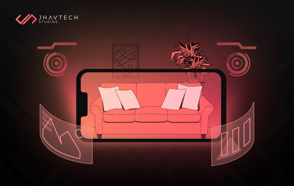
Augmented Reality has moved beyond gaming apps like Pokémon GO and is becoming a key player in industries like retail, education, and real estate. By 2025, AR integration will be one of the most exciting mobile app design trends, bringing immersive experiences to everyday apps.
For example, IKEA’s Place App lets users visualise furniture in their space, eliminating the guesswork of online shopping. Similarly, apps like Google Lens leverage AR to enhance learning by overlaying information on real-world objects.
Market Insight
The AR market is projected to hit $198 billion by 2025, creating ample opportunities for apps to deliver next-level engagement.

Super Apps and Effortless Navigation
Super apps—a single app that bundles multiple services—are revolutionising the mobile landscape and reshaping how users interact with digital platforms. These all-in-one solutions offer unparalleled convenience by combining services like messaging, payments, and shopping within a single interface. While already popular in Asia with platforms like WeChat and Grab, the concept of super apps is now gaining momentum globally.
In 2025, mobile app design trends will emphasise simplifying navigation within these multifunctional apps. Key features like intuitive dashboards, quick-action buttons, and micro-interactions will not only enhance user engagement but also highlight the role of mobile app development in making complex platforms feel seamless and user-friendly.
Dark Mode 2.0: Beyond Aesthetics
Dark mode has cemented its place as a user favorite, but in 2025, it’s evolving into a more sophisticated design element. Dynamic dark mode, which adapts to ambient light or user schedules, will enhance user experience while reducing eye strain and saving battery life.
Apps like Instagram and YouTube are already leveraging dark mode to improve usability, and the next wave will incorporate it into dynamic, user-responsive designs.
Did You Know?
Apps offering dark mode see a 15-20% increase in user retention rates, highlighting its importance in modern app design and successful app development.
Biometric Authentication for Seamless Security
Biometric authentication is becoming a design staple, combining security with ease of use. By 2025, fingerprint scans, facial recognition, and even voiceprints will be more than just login options—they’ll be integral to creating smooth, frictionless user experiences.
For example, banking apps like Chime and Revolut are making biometric authentication a core part of their design, ensuring secure yet seamless access to sensitive information.
Design Tip
Integrating biometric elements subtly into your app’s interface can enhance trust and elevate the user experience.
Sustainable Design for a Greener Future
As environmental awareness grows, sustainability is becoming a key aspect of mobile app design trends. Developers are focusing on energy-efficient designs that reduce battery consumption and promote eco-friendly behaviors.
Apps like Olio and Ecosia lead the way with green initiatives, while features like dark mode and minimalistic interfaces contribute to energy savings. Looking ahead to 2025, more apps will adopt sustainable design principles, from eco-friendly coding to carbon-offsetting features. This movement will help developers create greener apps and inspire users to make conscious choices, aligning technology with environmental goals.
Why This Trend is Vital
A sustainable app not only reduces its environmental impact but also appeals to eco-conscious users—a growing demographic in 2025.

3D Graphics and Cinematic Animations
Static designs are a thing of the past. In 2025, 3D graphics and animations will redefine how users engage with mobile apps. These elements add depth, interactivity, and a wow factor that captivates users, creating a more dynamic and engaging experience.
For instance, gaming apps like Call of Duty Mobile and retail apps like Zara are incorporating 3D visuals to provide immersive experiences. These designs are also appearing in onboarding screens and interactive tutorials, adding a cinematic touch to apps. As app development continues to evolve, 3D elements will become more accessible, allowing brands across industries to offer visually stunning and highly engaging user experiences.
Accessibility at the Core
Accessibility isn’t just about compliance—it’s about inclusion. By 2025, mobile app design trends will prioritise features like larger text sizes, voice assistance, and color-blind friendly themes.
Apps like Microsoft Teams and WhatsApp are leading this trend with features like real-time captions and high-contrast modes, ensuring their platforms are usable by everyone, regardless of ability.
Stat Spotlight
The World Health Organization estimates over 1 billion people live with some form of disability, emphasising the importance of accessibility in app design.
Wearables and Cross-Device Experiences
With wearables like smartwatches and fitness trackers becoming ubiquitous, mobile app design trends for 2025 will focus on creating fluid experiences across devices.
Apps like Strava and Apple Health are great examples of how cross-device integration can enhance user engagement, offering consistent experiences on phones, wearables, and even desktop applications.
Pro Tip
When designing for wearables, prioritise glanceable content and quick interactions to make the most of limited screen space.
Final Thoughts…
The mobile app design trends for 2025 reflect a shift toward smarter, more inclusive, and user-friendly interfaces. From hyper-personalisation and AR integration to sustainable design and biometric authentication, these trends emphasise the importance of creating meaningful and engaging experiences.
As the industry evolves, staying on top of these trends will be crucial for businesses looking to stand out. So, whether you’re building your first app or enhancing an existing one, now is the perfect time to incorporate these cutting-edge design elements.
Ready to bring your app idea to life? Get in touch, and let’s make your vision a reality!
.svg)

